
Alexandria Capital
WEB AND BRANDING REFRESH. UXUI. BRANDING. GRAPHIC DESIGN. USER RESEARCH. RESEARCH PSYCHOLOGY. BRAND CREATION AND DESIGN. PROTOTYPE DEMONSTRATION.
In early 2022, I was given the project to re-design the website for one of our advisory team businesses. This is a common request that we do often. However, this task came to me at the end of completing my NNG certification course in User Experience Design. I wanted to go above and beyond to display the takeaways I took from the NNg courses I had just completed.

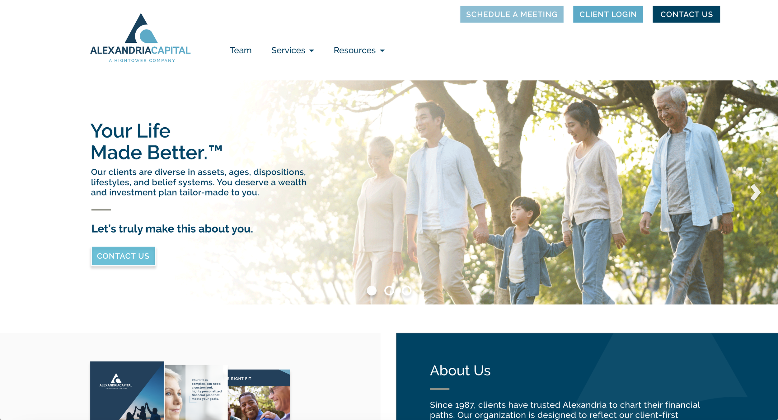
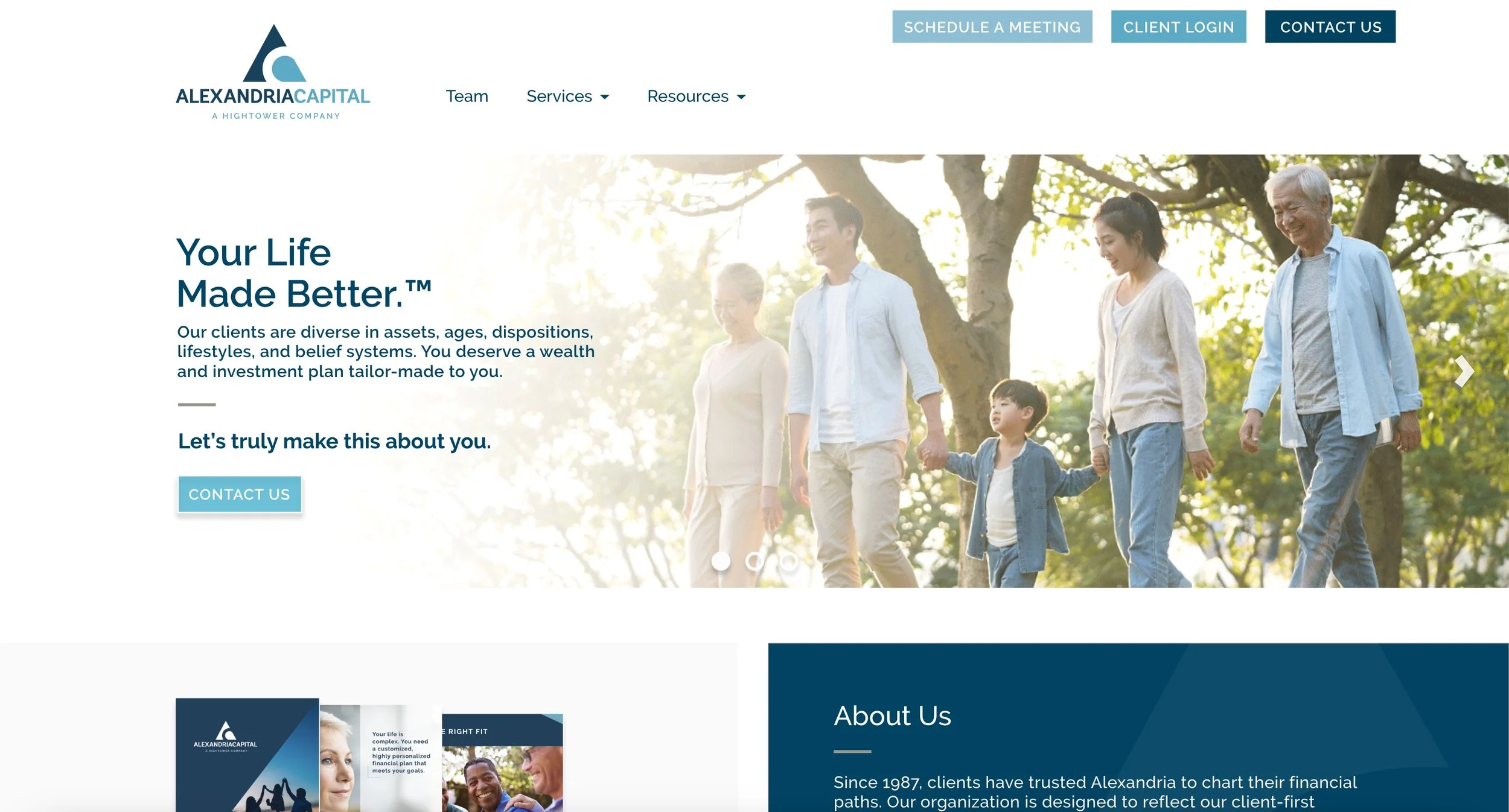
Final Homepage Design


Introduction
Overview and problem statement
Alexandria Capital requested an update or “re-skin” to their website, starting with their homepage.
Primary Goals of the Re-skin:
Improve user experience
Reduce user frustration
Improve navigation
Improve aesthetics; re-skin to a design that more clearly communicates the brand
Improve core messaging and communication
Secondary Goals of the Re-skin:
Improve user experience
Attract new potential clients
Scope
This project included competitor research, preparing materials for the research study (which included developing materials for the study, gathering participants for the study, holding user studies, quantifying data and analytics, and analyzing findings).
Once the research study was completed, presentation decks were prepared to present findings to key shareholder.
After the research findings were developed and data was quantified, webpage designs were developed and prototyped with interactivity based on what was found in the user tests.
Review meetings for feedback and changes post-design process.
Research and design
User research sessions
Multiple one-on-one sessions as well as group sessions were held with the following PDF. Please see the presentation below for how the user research was conducted.
User research results
After the user research sessions were held, the data was analyzed and curated into a presentation for key stakeholders. Please see the presentation below for how the user research was conducted.
Establishing initial goals
First steps
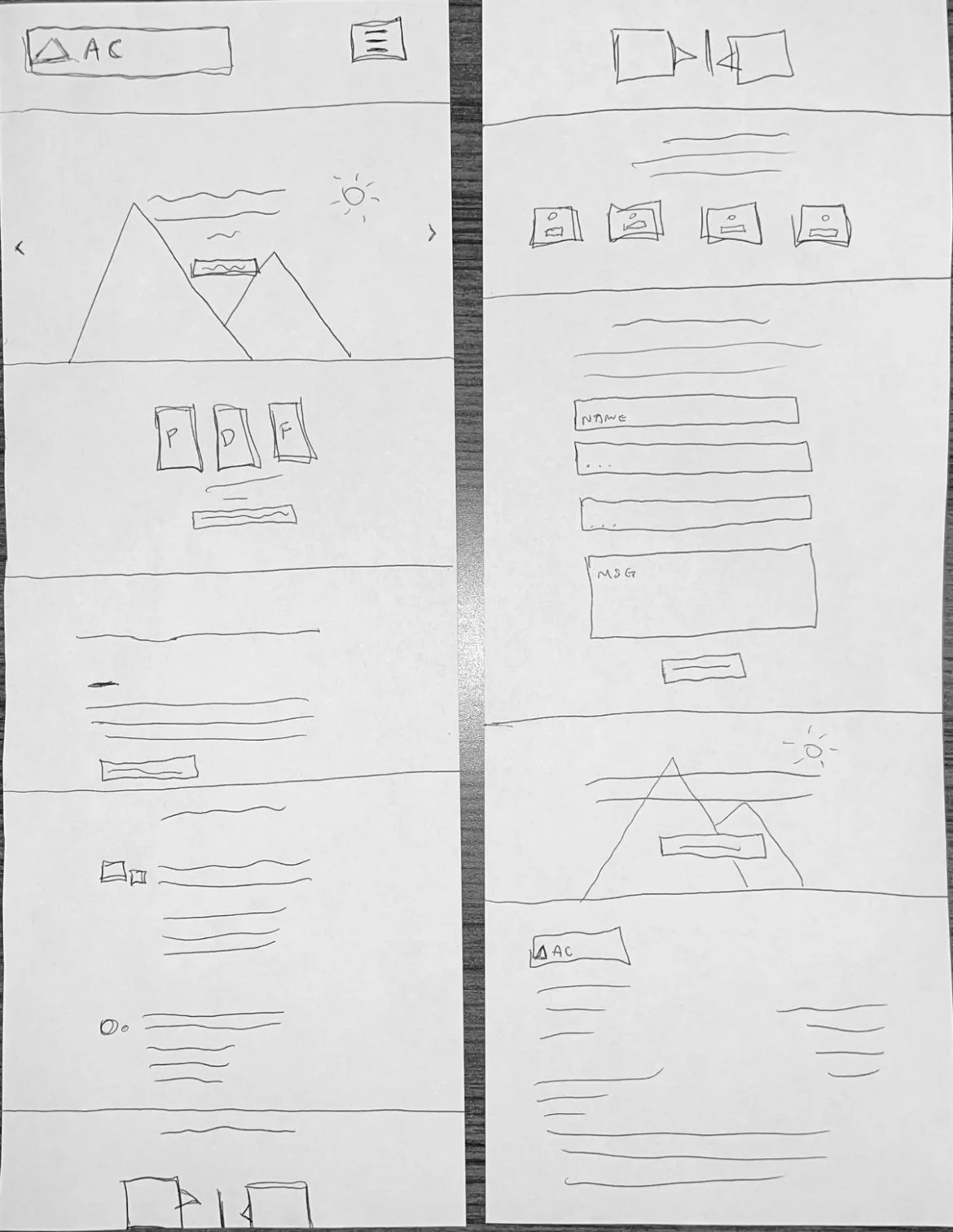
Wireframes were developed for the homepage, along with various design elements that were added, implemented, or changed from the prior site (based on user research findings).
Shareholder feedback and buy in
Review session with key shareholders and other design/ development team members was held to iterate on and further refine wire frames
Wireframes were refined based on feedback
Final approval from key shareholders was given, and the digital design portion began
Wireframes
Desktop
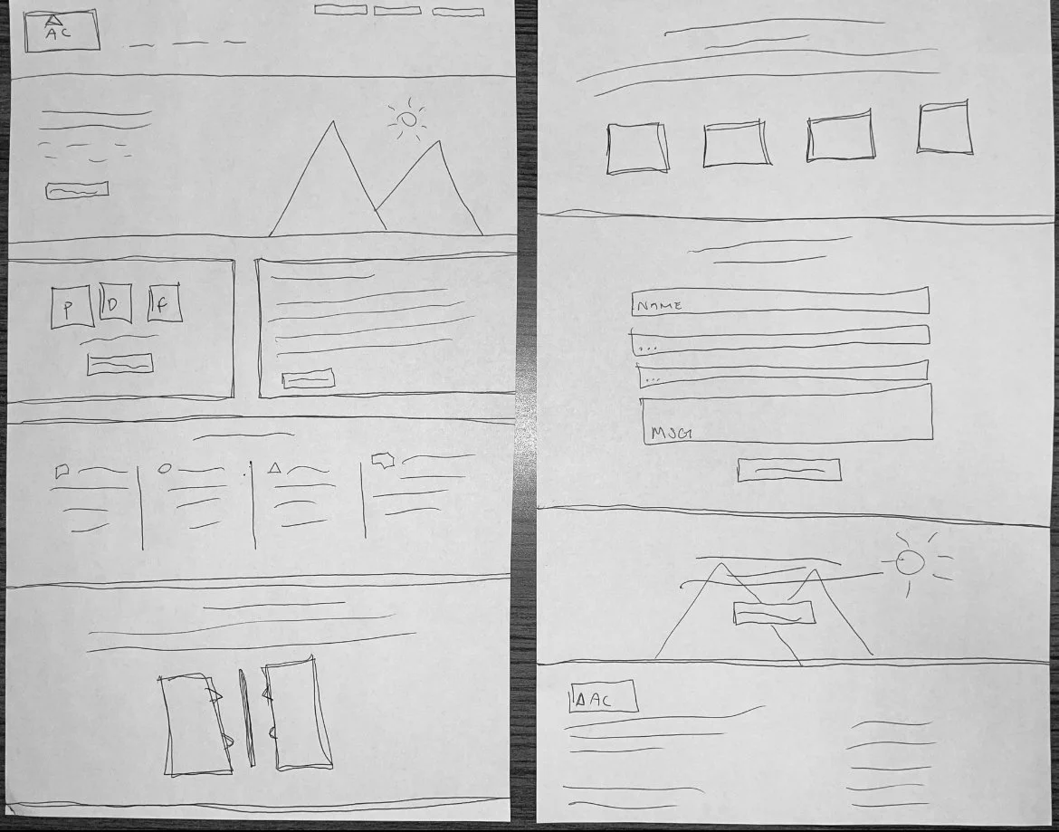
Mobile
Digital portion: before and after comparisons
Before

Key improvements - hero section
Change the 3 second carousel to a 8-10 second carousel
Add carousel buttons at the bottom center of the hero image to allow the user to click through, and also know which hero they are on with the filled or outlined button
Left align the hero and add a white gradient to ensure text is legible. Additionally, the users eye moves from left to right, so the hero text will be the first thing they read
Improve menu by condensing items and re-arranging order
Improve buttons by using various shades of blue, and changing the call-to-action button text to be more appropriate for the button action
Choose lighter, brighter hero images that portray clients and families (key client base) in natural, calm settings - rather than staring directly into the camera
Before

After
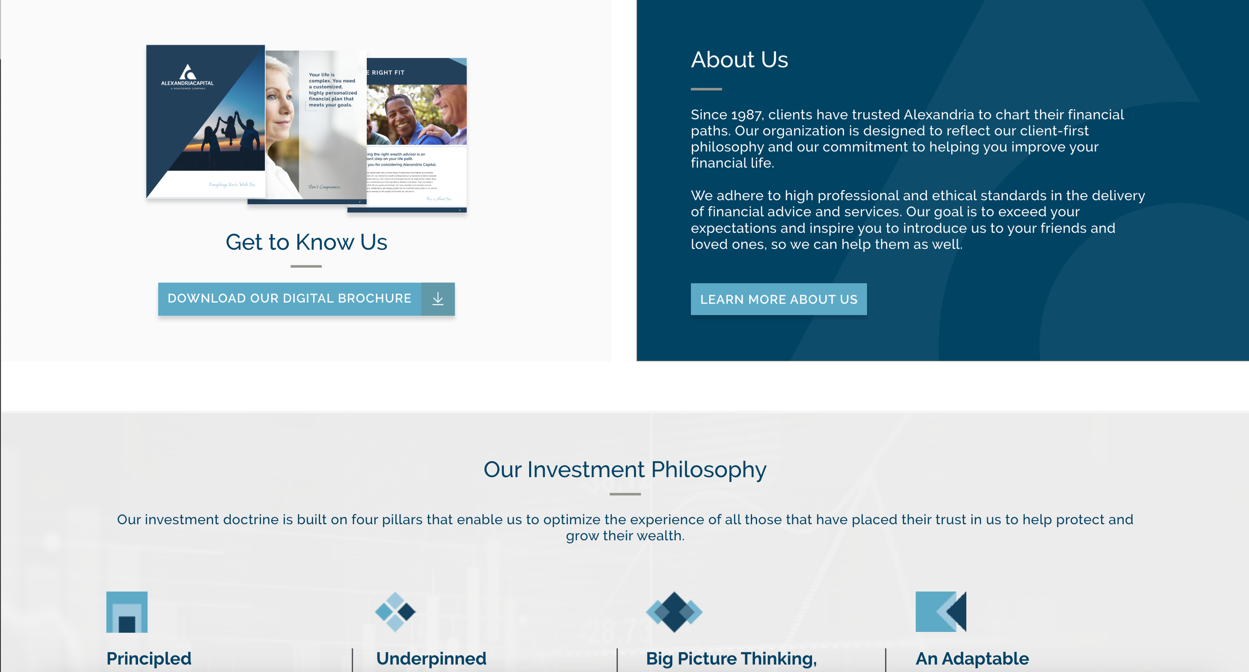
Key improvements - about us section
Remove segmented client imagery that silos a potential client
Utilize the digital brochure in a more friendly way, rather than the broken file icon previously on the page
Add an “About Us” section to introduce the brand to clients
Add more call-to-action buttons where appropriate
Before
After
After
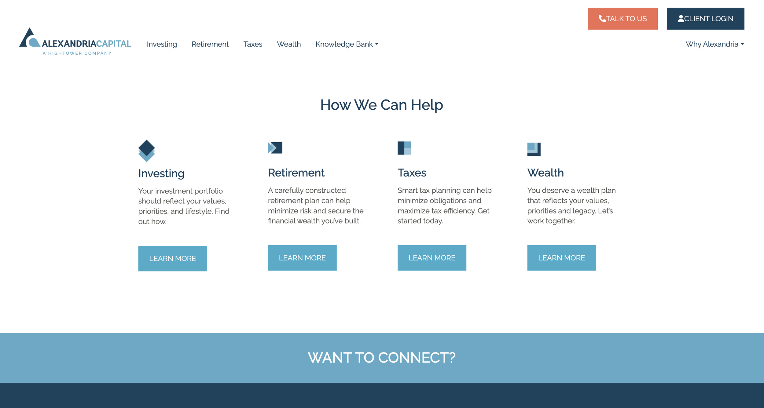
Key improvements - how we can help section
Add a background and elements to divide the content
Utilize the space better
Decrease amount of redundant buttons
Before

After

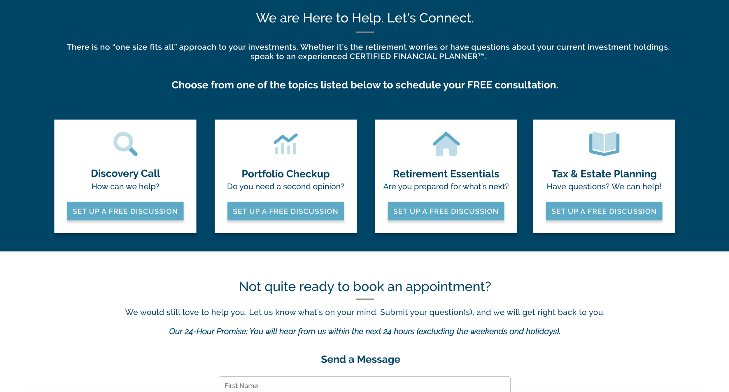
Key improvements - connect call-to-action section
Highlight service offerings and replace the platform area
Highlight the free consultation offering
Implement a form field rather than a singular button to let a user easily send a message
Final Design Gallery


Disclosures and disclaimers
All photography used or shown was legally obtained with a commercial use license from Shutterstock. All icons used were obtained with a commercial use license from FontAwesome. All written content, videos, or other website collateral is owned by Hightower Advisors, Alexandria Capital &/or affiliates. I do not claim to own any of these pieces specified above, nor any other intellectual materials on AlexandriaCapital.com. I contributed to the website design and do not own any of these materials. Work shown on the portfolio web page displaying the process work are simply for display and documentation of design processes only.
I MAKE NO WARRANTIES RELATED TO THE PERFORMANCE OR OPERATION OF THIS WEBSITE. I MAKE NO REPRESENTATIONS OR WARRANTIES OF ANY KIND, EXPRESS OR IMPLIED, AS TO THE INFORMATION, CONTENT, MATERIALS, PROGRAMS, PRODUCTS OR SERVICES INCLUDED ON OR THROUGH THE WEBSITE HIGHTOWERADVISORS.COM OR ALEXANDRIACAPITAL.COM.
See more of my work!

A Taste of History

The New Seedling Foundation

Hightower Advisor's Website


Nostalgia - The Zine

Medlink