
Hightower Advisors
WEB AND BRANDING REFRESH UXUI. BRANDING. GRAPHIC DESIGN. USER RESEARCH. RESEARCH PSYCHOLOGY. BRAND CREATION AND DESIGN. PROTOTYPE DEMONSTRATION.
This project started in October 2021, and initially concluded in March 2022.
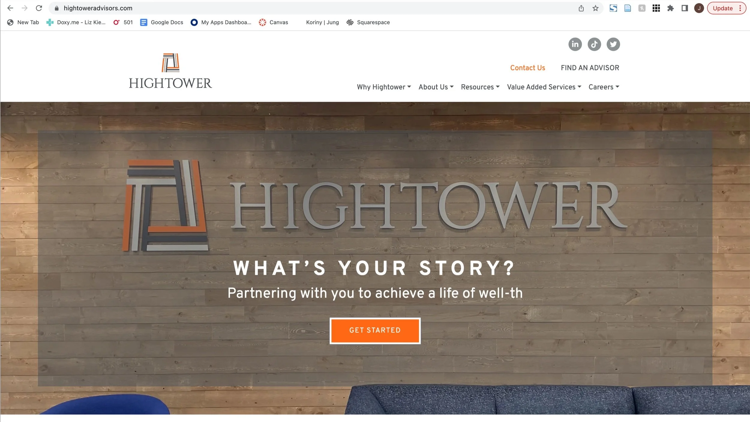
Hightower Advisors was in need of a website and visual identity ‘re-vamp.’
The idea of the ‘re-vamp’ rather than a ‘re-brand’ was to keep the logo, fonts, and brand guidelines the same to make for less of an overhaul (due to the many advisory teams Hightower works with and shares branding with, along with the general issues that come with re-branding and creating a new logo).
Without changing any of the core branding or messaging, the goal was to give the brand identity a refresh and modernize the external-facing image selectively, and to work with what was already provided from the brand guidelines.

Final Design Gallery


Introduction
Overview
Hightower Advisors was in need of a website and visual identity ‘re-vamp.’ The idea of the ‘re-vamp’ rather than a ‘re-brand’ was to keep the logo, fonts, and brand guidelines the same to make for less of an overhaul (due to the many advisory teams Hightower works with and shares branding with, along with the general issues that come with re-branding and creating a new logo). Without changing any of the core branding or messaging, the goal was to give the brand identity a refresh and modernize the external-facing image selectively, and to work with what was already provided from the brand guidelines.
Core branding

Scope
Introduction. This web re-design and marketing project is being undertaken by Jocelyn Gilbertson, Graphic Designer at Hightower Advisors to improve brand recognition, usability, aesthetics, as well as overall improvements both visually and in written content.
Project scope. The project will include research, competitor assessments, ideation, collaboration with content writers, and publishing on the company website, in May of 2022. Jocelyn Gilbertson will work interim with fellow graphic designer, marketing leads, content writes and managing directors. The marketing team will contribute to these site improvements by providing content and additional user feedback.
Deliverables. Deliverables for the project will include compliance approved written page content documents that is finalized in a web page design, no later than May 9th, 2022. Acceptance criteria. The website will improve user experience, and longterm, improve site traffic and brand recognition. Due to limitations on Hightower’s tracking of site traffic, a successful site design will be determined by internal Hightower Corporate employee feedback, as well as the (optional, at will feedback) of over 120 advisory firms.
Exclusions. This project will not need to have multiple deliverables.
Constraints. This project has a hard due date of May 9th, 2022, in order to present the new website branding and experience at a corporate hosted event geared to support advisory team marketing efforts.
Planning, timelines and execution
PLANNING — PHASE I: Collaborate with fellow graphic designer to decide where the future direction of the brand identity is headed. Following that, establish a visual identity for the site that is in line with the direction of other future collateral for seamless, clear messaging and tone throughout all branded content.
TIMELINE & EXECUTION STEPS — PHASE II:
Research and problem-solving
Goals
Wire frame development
Image and content gathering
Design digital assets
Gather feedback and implement requested changes
Finalize design internally (key shareholders, marketing team and development team)
Review and test prior to final launch
Research and design
Examining the site and the issues
Competitor research
When examining competitor sites, the main takeaways were as follows:
They use a more strategic, minimal color scheme which falls directly in line with their branding
They either use full color imagery, or sometimes black and white imagery
Imagery is selectively chosen to both reflect the brand identity visually, and the core messaging/ target markets
Buttons are uniform and used consistently
Hero images/ banner images, accompanied by page title, are used to begin a page
They implement modern, sans serif fonts for almost all text on pages (and if another serif/ branded font is implemented, it is usually done for headers or in larger formats)
Their nav menu tabs are short, to-the-point, and easy to understand
H1, H2, body copy and so on are designed clearly and consistently with size, weight, color and placement
Hover states are used and generally effective in both usability and accessibility
Problem solving
CONSIDERING USABILITY HEURISTICS AND DESIGN
Source: “10 Usability Heuristics for User Interface Design” by Jakob Nielsen
*Specific points from the article were intentionally left out if they did not apply to the Hightower site or its functionality
“MATCH BETWEEN SYSTEM AND THE REAL WORLD - The system should speak the users’ language, with words, phrases and concepts familiar to the user, rather than system-oriented terms. Follow real-world conventions, making information appear in a natural and logical order.”
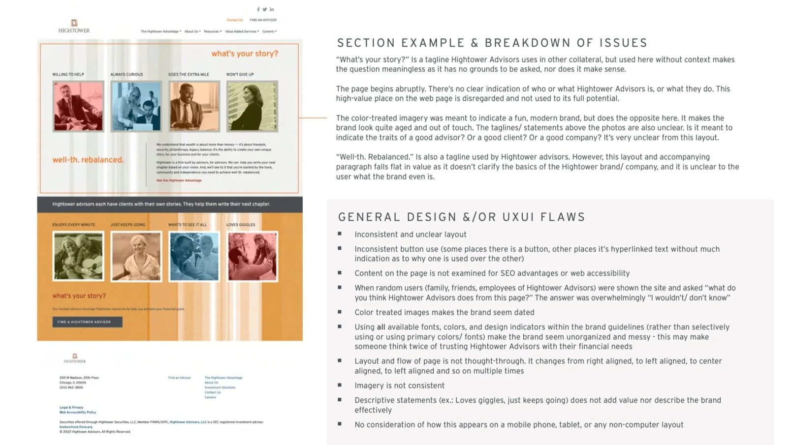
No, the current site is not effective in this. ‘Themed phrasing’ such as “goes the extra mile” or “willing to help” on the homepage is used in an attempt to set the brand apart from others as being client-focused, but is ineffective as it is not schema known by the typical user. The intent of who these adjectives are describing is also unclear. The current sites language is too hyper-focused on specifics and is geared towards users who are extremely familiar with the company, rather than introducing new users to the brand and systems.“CONSISTENCY AND STANDARDS - Users should not have to wonder whether different words, situations, or actions mean the same thing. Follow platform conventions.”
No, the current site is not effective in this. The site is dated in both language and visuals. Pages that are commonplace for attracting new users, such as the “About Us” page, are designed from a zoomed-in lens and it is unclear what the brand is, who the company is, and what they do.“RECOGNITION RATHER THAN RECALL - Minimize the user’s memory load by making objects, actions, and options visible. The user should not have to remember information from one part of the dialogue to another. Instructions for use of the system should be visible or easily retrievable whenever appropriate.”
No, the current site is not effective in this, as there is no common and understood direction or language throughout the site.“AESTHETIC AND MINIMALIST DESIGN - Dialogues should not contain information which is irrelevant or rarely needed. Every extra unit of information in a dialogue competes with the relevant units of information and diminishes their relative visibility.”
No, the current site is not effective in this, as there is overly specific verbiage and terms used throughout the site. Ironically, the intent of the original design has had the opposite intended effect: it was intended to give the user all the information they could possibly want or need to get to know the brand, but instead, confuses the user as it does not contain enough basic information about the brand, company or what they do.“HELP AND DOCUMENTATION - Even though it is better if the system can be used without documentation, it may be necessary to provide help and documentation. Any such information should be easy to search, focused on the user’s task, list concrete steps to be carried out, and not be too large.”
No, the current site is not effective in this, as there is overly specific verbiage and terms used throughout the site. Ironically, the intent of the original design has had the opposite intended effect: it was intended to give the user all the information they could possibly want or need to get to know the brand, but instead, confuses the user as it does not contain enough basic information about the brand, company or what they do.
Establishing initial goals
First steps
Sketch wire frames for the following pages: Homepage, Partner with Us, Well-th Stories, Find an Advisor, About Us, Meet the Team, Our History, Resources (overview), Insights, News, White Papers, Podcasts, Investment Solutions, Careers, Internships, and Contact Us.
*Note: beyond the wire frames displayed, many internal pages have the same general layout and content structure, so not all wire frames are displayed here. Only unique page wire frames are displayed. All wireframes can be viewed in the digital download of the process book.
Shareholder feedback and buy in
Have review session with key shareholders and other design/ development team members to iterate on and further refine wire frames
Refine wireframes based on feedback
Get final approval from key shareholders
Digital process
Begin digital design portion of project
Wireframes
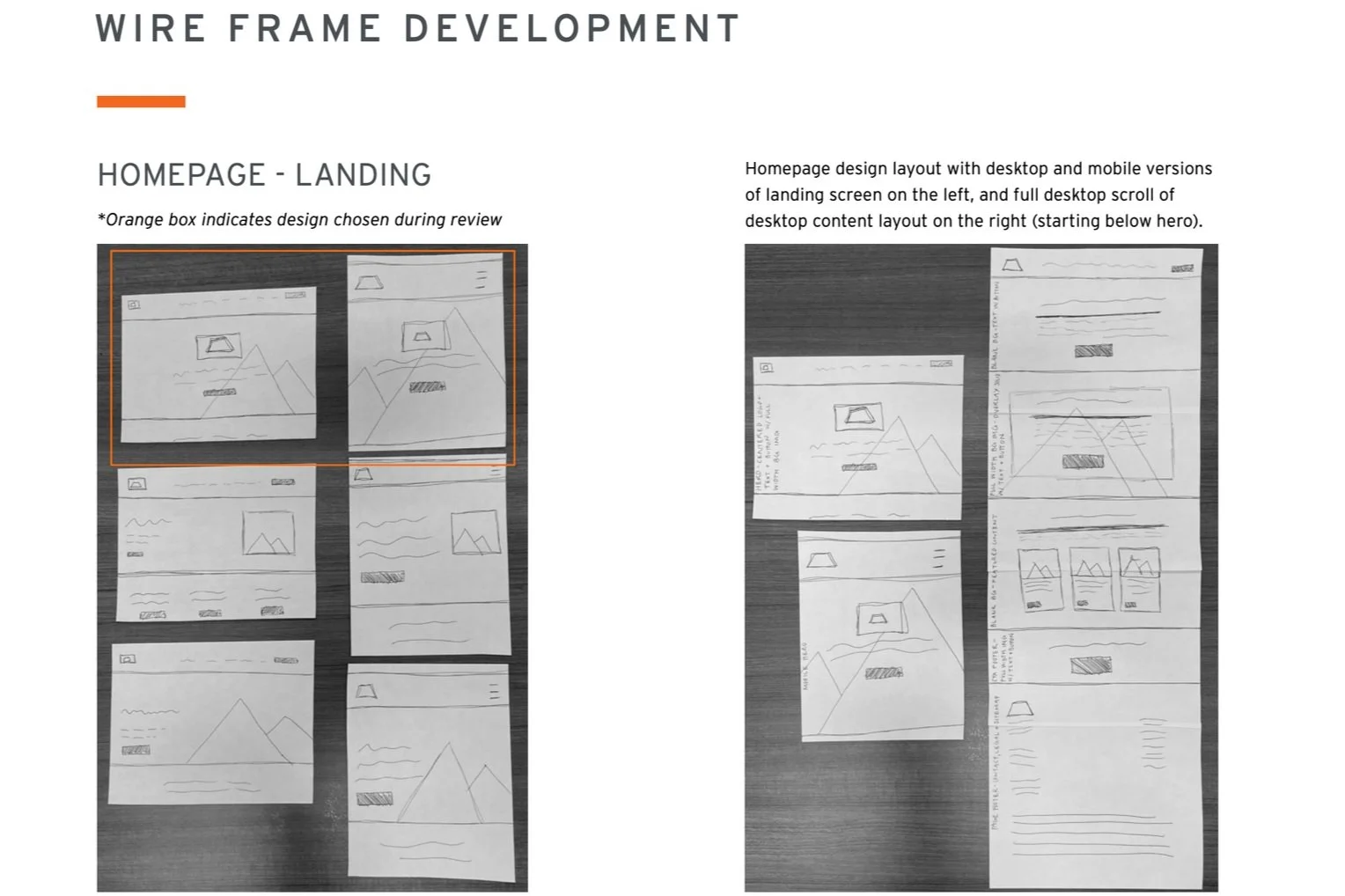
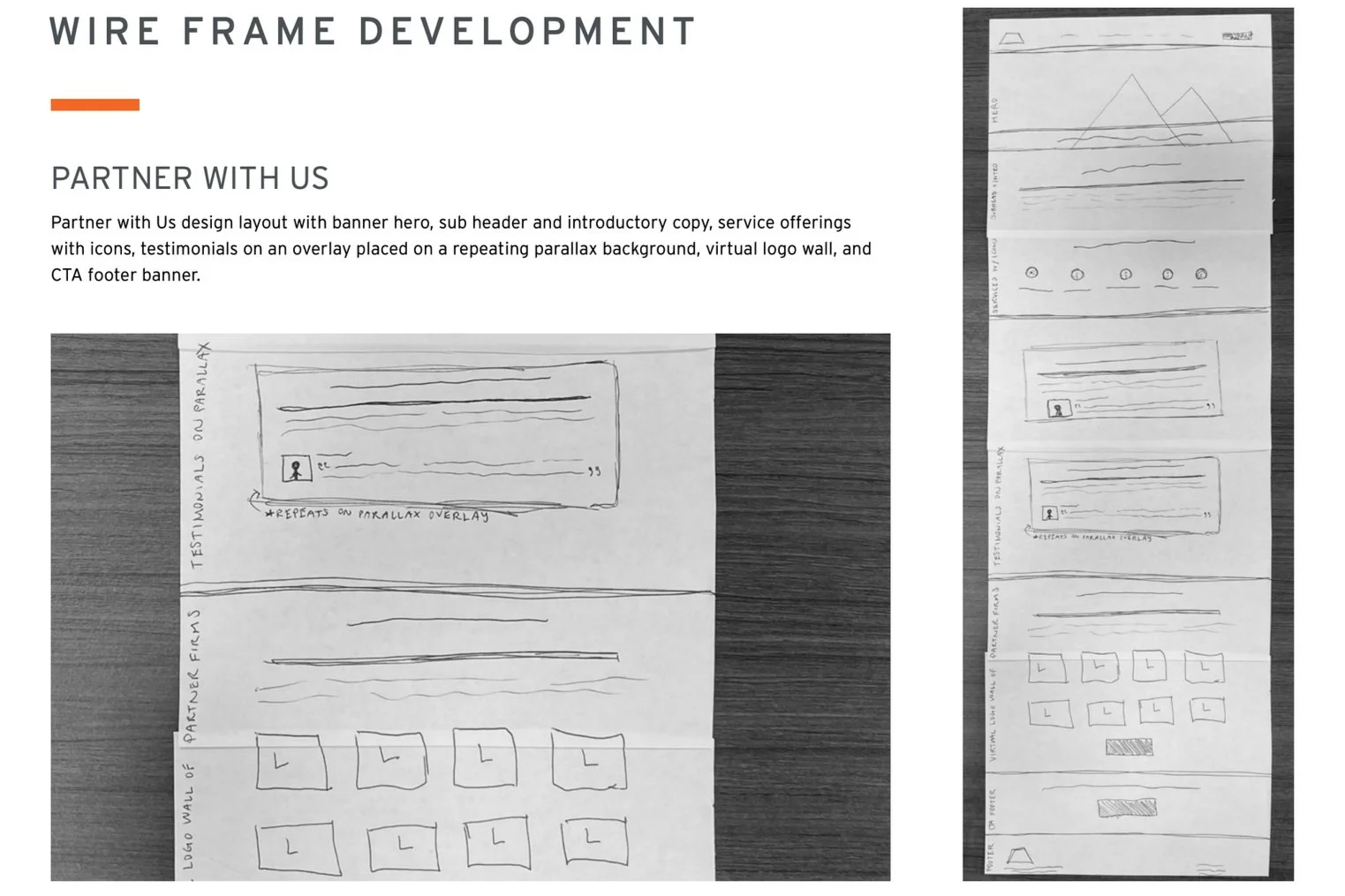

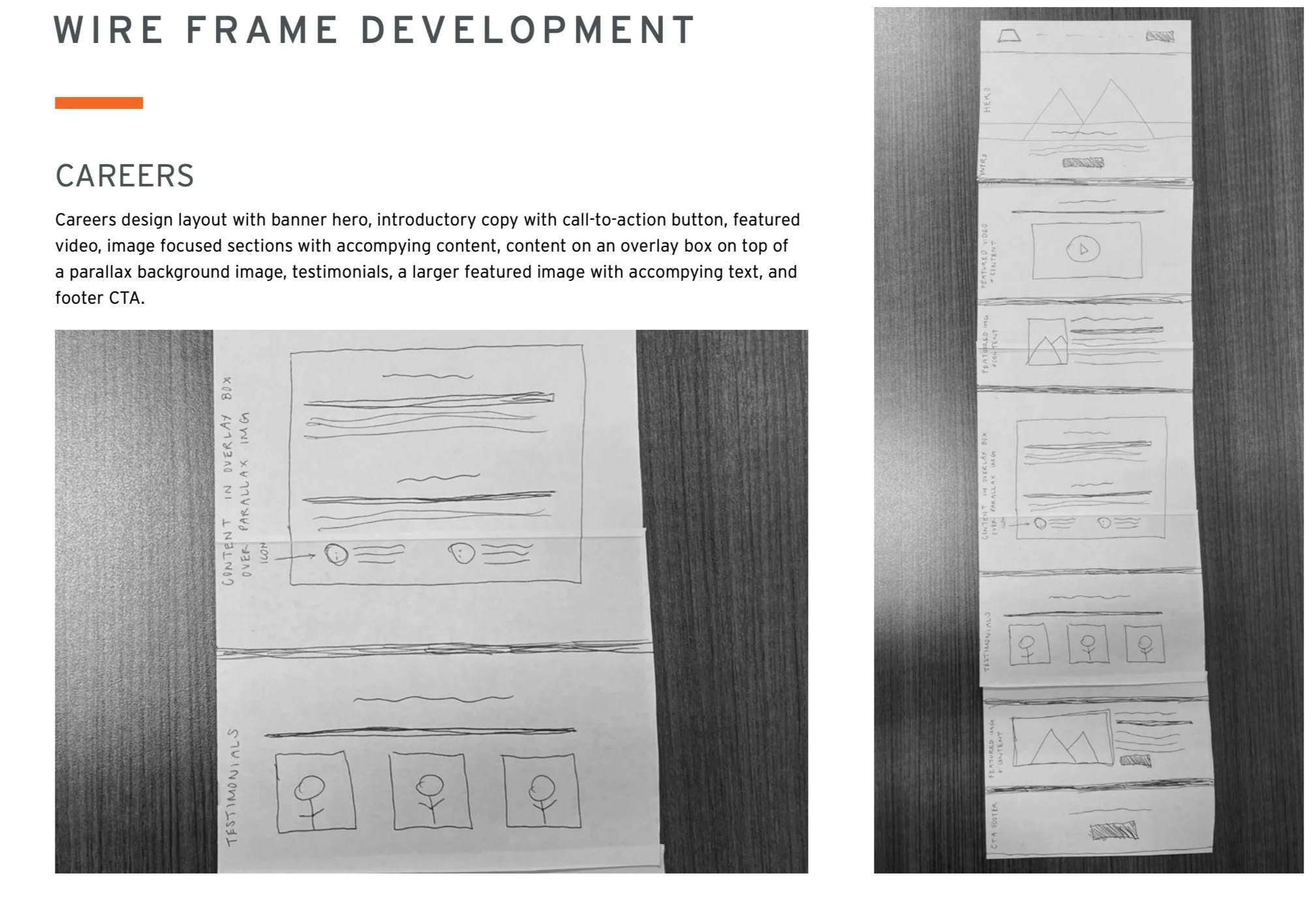
Image and content gathering


Digital portion: before and after comparisons


Site launch

Follow up maintenance and continued improvements


Final Design Gallery
Disclosures and disclaimers
All photography used or shown was legally obtained with a commercial use license from Shutterstock or from contracted event photography. All icons used were obtained with a commercial use license from FontAwesome. All written content, videos, or other website collateral is owned by Hightower Advisors &/or affiliates. I do not claim to own any of these pieces specified above, nor any other intellectual materials on HightowerAdvisors.com. I contributed to the website design and do not own any of these materials. Work shown in this process book or on the portfolio web page displaying the process work are simply for display and documentation of design processes only.
I MAKE NO WARRANTIES RELATED TO THE PERFORMANCE OR OPERATION OF THIS WEBSITE. I MAKE NO REPRESENTATIONS OR WARRANTIES OF ANY KIND, EXPRESS OR IMPLIED, AS TO THE INFORMATION, CONTENT, MATERIALS, PROGRAMS, PRODUCTS OR SERVICES INCLUDED ON OR THROUGH THE WEBSITE HIGHTOWERADVISORS.COM.
See more of my work!

A Taste of History

The New Seedling Foundation

Hightower Advisor's Website

Nostalgia - The Zine

Medlink

ACAP