Iowa State Rec. Services
WEB AND BRANDING REFRESH UXUI. BRANDING. GRAPHIC DESIGN. USER RESEARCH. RESEARCH PSYCHOLOGY. BRAND CREATION AND DESIGN. PROTOTYPE DEMONSTRATION.
The Iowa State Recreation Services app design was a semester-long UX/UI project, designed for those who would use the gyms on campus.
My theory behind choosing this topic to study & build an app around the campus gyms was simply because there currently isn't one. Iowa State has 36,000+ students as of 2019 & there is 2 campus gyms. State gym's capacity is ~250, & Lied gym's capacity is ~300. There is busier times & calmer times than others, & along with that some equipment is more sought after than others. There is no clear indication made by either facility that displays the capacity busyness by time, & busy students don't have the open gaps of time to try to go to either gym & arrive, just to find that what they plan to do isn't available.
This app would have a user-friendly design interface with clear icons and legible typefaces, for ease of use at any age. It would also use a dark mode display with lighter icons & text for readability. The main attributes that I feel would be the most beneficial are:
clearly displaying current capacity at both gyms
having a live display of current gym equipment available
having a clear & categorized fitness class sign up system
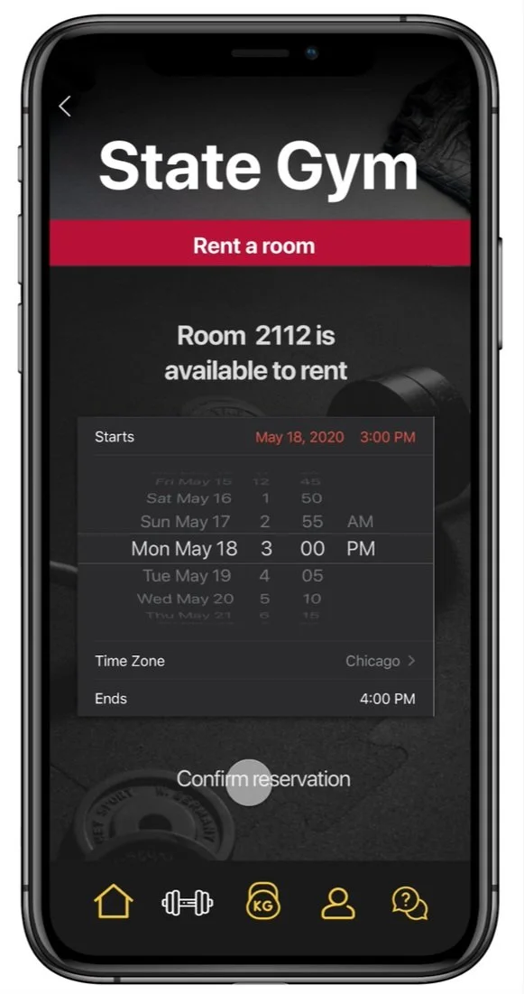
easily being able to reserve a studio space
providing a QR scanner system
having a section of the app for locker rentals & combinations
being able to alert an attendant to broken equipment, spills or messes, needing help with equipment, etc.
a clear FAQ section to address commonly asked questions

Final Project Screens
Introduction
Overview and problem statement
As a student at Iowa State University, my time is valuable (and crunched). On Iowa State’s campus, there are two gyms: State Gym and Lied Gym. State and Lied gym are almost always busy when | go. I visit these gyms at a variety of times between 7:30am-9pm, depending on the day. Given that I only have a set amount of time to workout, I’d like to know how busy the gym is at that time. However, there is no resource for this.
When conducting research, I visited the gym at various times and compared the busy-ness level to how busy google maps said that location was at the time. Google maps was wrong multiple times, and underestimated how busy it truly was, making my time at the gym less efficient, as I was not able to do what I wanted due to a lack of availability in equipment and space. I also tried to use Iowa State’s campus app to see if it could provide me any valuable information (it could not). My last idea was to call the front desk and ask how busy it was to a real person, but I found this awkward and also difficult due to different people having different interpretations of “busy.”
My solution is the separate, dedicated app: Iowa State Rec Services.
Scope
Introduction. This application design is being undertaken by Jocelyn Gilbertson, undergraduate student at Iowa State University, to help more students better utilize on-campus gym facilities.
Project scope. The project will include research, competitor assessments, ideation, collaboration with fellow students, and a final working prototype with walkthrough.
Deliverables. Deliverables for the project include a designed, fully prototyped application, with main functionalities highlighted for use.
Planning, timelines and execution
Introduction. This application design is being undertaken by Jocelyn Gilbertson, undergraduate student at Iowa State University, to help more students better utilize on-campus gym facilities.
Project scope. The project will include research, competitor assessments, ideation, collaboration with fellow students, and a final working prototype with walkthrough.
Deliverables. Deliverables for the project include a designed, fully prototyped application, with main functionalities highlighted for use.
Research and design
Term project proposal
Below is the initial presentation given to my class and professor, pitching my concept for the Iowa State Rec. Services app.
Personas
Below are the three main personas developed for this project.
Problem solving
Establishing initial goals
Steps
develop paper prototypes to map out layout and content
design digital wireframes to map out content, making the development of the app smoother and easier
begin to develop filler content for the application
Prototypes and wireframes
Paper prototypes
Below are the paper prototypes developed for this project.
Digital wireframes
Below are the digital wireframes developed for this project.
Complete re-design
First draft compared to second draft
After designing the entire first draft (of my first UXUI project) in full, I was not happy with the final product and knew it could be better. With help from my professor, we developed a game plan: re-do it… all of it. I had ~40 working screens to redesign with about 2 weeks left until the project was due.
My main changes between the new & old app were design oriented. I chose to make the backgrounds a dark, rich gray to have white type and icons pop against it, make my type sizes smaller, but still legible, choose icons that all had rounded edges rather than a mix of round and sharp edges, change typeface to SF Pro Display, get rid of the top bar (time, provider), and simplify the menu.

Final Project Screens
Disclosures and disclaimers
*DISCLAIMER: All icons & images that are not my own are credited in this document with proper links. No icons or images used are for commercial use. All icons & images are for educational purposes only, which is allowed by the provided sites. All icons & images are free for educational use from www.pixabay.com or www.flaticon.com, with proper accreditation provided per download links.

See more of my work!
A Taste of History
The New Seedling Foundation
Hightower Advisor's Website
Nostalgia - The Zine
Medlink


